Architexture

 Surface Design Research


What is surface design?

I find it a little unclear where exactly graphic design ends and surface design but Shannon McNab defines it as:
Surface design is any type of artwork (pattern, illustration, hand lettering, etc.) made by a designer that is intended to be applied to a surface to enhance its visual appearance and/or functionality.

Also, in her video Elizabeth Silver discusses how some purist believe surface design is a term reserved only for pattern making but she argues that "any art created to be mass manufactured on a product surface" is surface pattern design, or more loosely surface design.

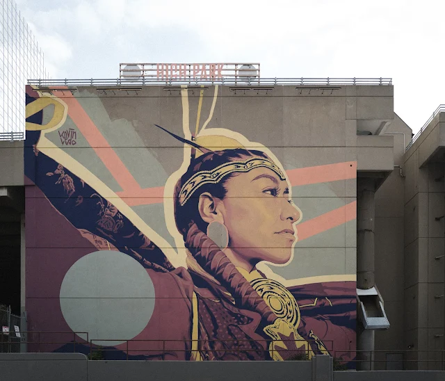
After doing some research I personally understand it as any design intended for the surface of a three-dimensional object. This excludes things such as posters and billboards where the focus is mainly two-dimensional, but I would included murals as the three-dimensional aspect of the building is considered.

A mural of an Indigenous dancer on a concrete wall

Streets & Architecture

A tall grey rectangular textured pattern on a building

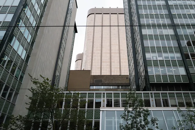
Something that caught my eye with architecture was how it uses surface design to add some visual interest to otherwise boring features. Flat walls can have depth simply by using a repeating pattern of colour or simple texture. Sometimes the design has a function but it doesn't have to.

Close up of several windows surrounded by a dark scale pattern of metal. A street view of a building covered in a green diamond pattern texture Street view of a building with a patterned of mixed coloured glass panes.


That kind of surface design is a planned way to add vibrancy to the streets but what I find the most intriguing is the unplanned surface design added to buildings. Stuff like stickers, graffiti and murals. In opposition to the designer of the building's surfaces making the decision about how street and surrounding area will look and feel, street artists and people who actually use the area can change that by modifying the surface design themselves.


An abstract colourful mural on the side of a light brick building.

Three basic houses painted on the side of a dark brick building

A large abstract colourful painting on the side of a big building downtown.

An abstract colourful mural on the side of some dark brick stars

A metal gate in a wavy shape with random patterns of colour covering some areas

Surface design doesn't only have to be about aesthetics though. It can have function and purpose as well. One really valuable function I noticed in my research is its use in providing access to the disabled community.


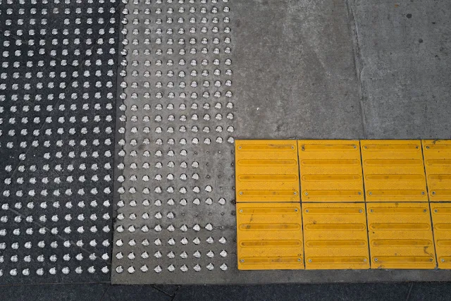
Braille is an entire language built using surface design. By using precise patterns of raised dots on a surface a visually impaired person is able to read. In a similar way, surface design is used on the streets to alert people to obstacles.

Protruding metal dots and yellow plastic strips on concrete designating stairs and a ramp.

Protruding plastic bumps on a yellow pad to designate the ramp to the road.

Commonality

Cartoon mural on a container in the background and in the foreground flags on a fence with a similar theme to the mural

One of the biggest strength surface design that I found was its ability to provide sense of connection between objects and places. When surface share a visual language through repeating patterns and colours they quickly become connected, which can be a very powerful tool when it comes brand recognition and cohesion.
 
Looking up at buildings covered in a green diamond pattern texture. Behind them are two towers with brass coloured windows.

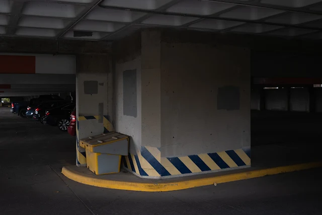
When that visual language becomes a motif, or a standardized set of patterns, it can be particularly useful when trying to convey universal messages. Patterns like crosswalks painted on the road surface are globally recognized and to similar extent the diagonal alternating lines that represent a sort of spatial warning.

Workers stand in front of a truck with large diagonal red and white alternating stripes

An ambulance, a firetruck and a police vehicle parked faced away from the camera. Each with a pattern of diagonal alternating stripes. The ambulance pattern is blue and yellow, the firetruck red and yellow and the police vehicle is black and white.

Underground parking garage with alternating diagonal lines to warn of the curb and wall.

I always knew that surface design was an interesting aspect of object making but I didn't realize how fascinating I would find the research. What was supposed to be a walk to the train, ended up being a walk all the way to campus as I got lost documenting all the patterns I was finding in the patterns. The most significant aspect of the research though was making the connection between surface design and accessibility as it's something I'm working towards learning more about.

Comments

Popular posts from this blog

Fruits Of My Labour

French Press Finesse

Crashing CAD Candy Castle